English version below
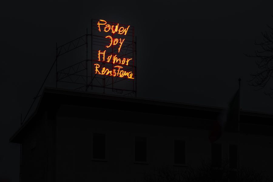
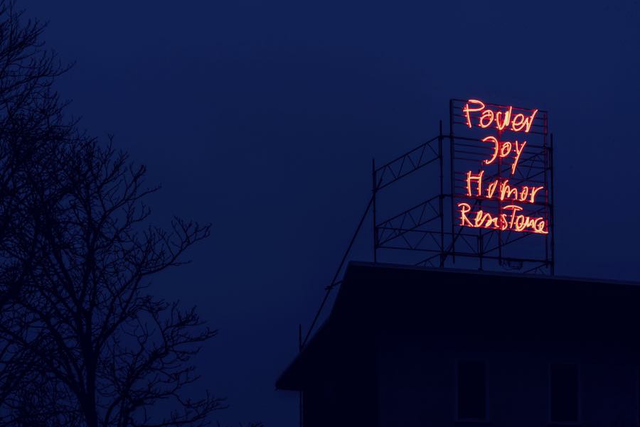
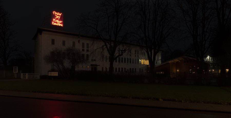
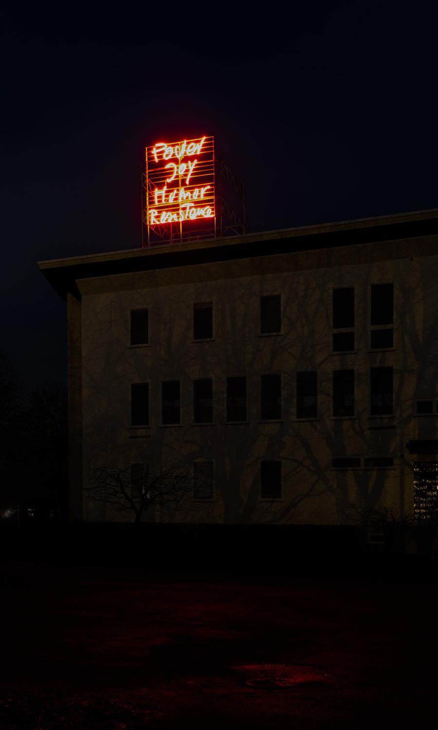
Una grande scritta luminosa appare sul tetto dell’Istituto Italiano di Cultura C.M. Lerici di Stoccolma, progettato da Gio Ponti: “Power Joy Humor Resistance” (a cura di Adriana Rispoli). Monica Bonvicini sceglie un insegna luminosa per veicolare un messaggio diretto e senza ambiguità che si presenta come “una rivelazione, che permette a chi l’osserva di essere attento a ciò che lo circonda e di diventare il protagonista del suo fruirne.”
Nell’intervista che segue l’artista ci racconta come è nata e da quali riflessioni è scaturita questa installazione. Scopriamo che tra il 2019 e il 2020 l’artista ha lavorato ad una serie di opere su carta concentrate sul tema della rabbia come energia positiva femminista. Da queste letture, l’artista cita il libro “Rage Becomes Her. The Power of Women’s Anger” di Soraya Chemaly, giornalista americana e attivista per i diritti delle donne.
EB: L’ambiguità è uno degli strumenti più efficaci per destabilizzare i tanti codici che governano la nostra società. Penso che anche la grande installazione luminosa che hai pensato per l’Istituto Italiano di Cultura C.M. Lerici di Stoccolma, sia mossa da questo efficace strumento stilistico. Mi racconti da dove è nata l’idea per “Power Joy Humor Resistance”? Che nesso ha con il libro “Rage Becomes Her. The Power of Women’s Anger” della giornalista e attivista americana Soraya Chemaly?
MB: Non c’è niente d’ambiguo nel lavoro. In realtà, il messaggio è diretto. Nel 2019 e nel 2020, ho letto moltissimi libri sulla rabbia delle donne. Nuovi contributi letterari al tema sono emersi soprattutto a seguito del movimento #metoo e al revival del femminismo degli ultimi anni. Mi servo di diverse fonti e citazioni tutto il tempo, per la maggior parte scelte dalle approfondite conferenze che ho seguito all’UdK. A loro volta le citazioni subiscono dei cambiamenti per creare dei diversi livelli di significato ed essere manifesto o poesia. L’anno scorso, durante il primo lockdown dovuto alla pandemia di Covid-19, ho iniziato quella che è diventata una grande serie di disegni, realizzati con lo spray, dal titolo NEVER TIRE. Alcuni di questi disegni sono apposti su pannelli di alluminio, come se fossero dei cartelloni di protesta. L’ultimo anno è stato un anno eccezionale, al di là dell’orrore della pandemia, in cui si è visto un incremento delle politiche disgreganti. Si pensi alla brutalità della polizia negli Stati Uniti che ha dato origine al movimento Black Lives Matter, ma anche ai regimi della Polonia o della Turchia, così come le proteste della popolazione ad Hong Kong e in Brasile. Io continuo a realizzare sempre dei lavori che si relazionano ad una storia che si ripete e che ripete sé stessa negli eventi e nelle notizie. Questo è il caso di NEVER TIRE.
Uno dei disegni appartenenti a questa serie si contraddistingue per la citazione tratta dal testo di Soraya Chemaly. Quando Adriana mi ha invitata a progettare qualcosa per la facciata dell’edificio di Gio Ponti a Stoccolma, ho immediatamente pensato ad un’insegna al neon. Questo non ha nulla a che fare con l’edificio, che rimane un esempio autonomo e indipendente di una progettazione architettonica ben riuscita. Quello che mi ha colpito è la posizione dell’edificio in relazione al tessuto urbano. Il palazzo è circondato da ambasciate e si colloca alla fine della strada come in un cul de sac, aprendosi sul Gärdet, il più grande parco e area verde di Stoccolma. Quello che una volta veniva utilizzato a scopi militari, è oggi uno spazio aperto per chiunque voglia fare un giro e respirare aria pulita. Gli inverni nel Nord Europa sono particolarmente lunghi e volevo portare energia e un messaggio inaspettato in un luogo altrimenti vuoto e disabitato.
EB: Ritengo che il linguaggio, alla stregua dell’architettura e di tanta parte della cultura materiale occidentale sia prodotto (e dominio) dell’uomo che ha escluso – ed esclude – l’importanza e la profondità delle donne. In che modo ritieni che l’arte, è in particolare, la tua, è efficace per ‘graffiare’ questo secolare, se non millenario, disequilibrio?
MB: Dagli anni Novanta, tutti i miei lavori riflettono questi temi. Graffiarne solamente la superficie non è però abbastanza. Non è solo una questione di riconoscerne gli squilibri, ma è soprattutto una questione di sabotaggio delle strutture che indirizzano il modo in cui si guarda e si pensa. Voglio destabilizzare queste considerazioni antiquate sull’architettura, ma anche sul potere e sul genere, per dimostrare come la loro imposizione e il loro controllo sia di fatto qualcosa di arbitrario. Questo riguarda anche il contropotere dell’arte e della cultura e come questo possa rivelarsi uno strumento per lo spettatore affinché sia in grado di reagire – autonomamente e indipendentemente – contro la versione di una realtà nociva e normativa.
EB: Una grande scritta luminosa visibile e fruita come un cartellone pubblicitario. Indubbiamente uno strumento semplice, diretto ed efficace per comunicare. Chi si imbatte in questa scritta, si porrà sicuramente delle domande. Quali interrogativi auspichi di sollevare? Quali ragioni pensi siano sottese a queste domande?
MB: L’architettura è spesso espressione di qualcosa che è stato celato: al contrario, un’insegna luminosa, posta in un luogo buio e isolato, è esattamente l’opposto, una rivelazione, che permette a chi l’osserva di essere attento a ciò che lo circonda e di diventare il protagonista del suo fruirne. I sistemi istituzionali del controllo assumono diverse forme. L’insegna al neon potrebbe avere una connotazione di manifesto, ma il messaggio di Power Joy Humor Resistance non è necessariamente determinato da questo aspetto. Il segno indeterminato è esso stesso un atto di resistenza contro il meccanismo di ciò che è significativo o ha valore nel nostro tempo e di ciò che significa empatia oggi.
Ha collaborato Veronica Pillon —

Monica Bonvicini, Power Joy Humor Resistance
Interview with the artist —
Elena Bordignon: We often consider ambiguity as an instrument to destabilize the codes which rule our society. I think your light installation, designed for Istituto Italiano di Cultura C.M Lerici in Stockholm, arises from ambiguity. Would you like to tell me where the idea for Power Joy Humor Resistance come to life? What is the connection between your work and the book Rage Becomes Her. The Power of Women’s Anger written by the American journalist and activist Soraya Chemaly?
Monica Bonvicini: There is nothing ambiguous in the work. It is a straightforward message. In 2019 and 2020, I read a lot of books on female anger. A lot of new literature came on that theme, which also followed the #metoo movement and the new feminist revival from the last years. I use different sources and quotations all the time, mostly chosen from the extensive lectures I do at the UdK. The quotations are also often changed to create new levels of meaning, be it a manifesto or for the texture for poetry. Last year during the first Covid-19 lockdown I began what became a large series of sprayed drawings under the general title NEVER TIRE. Some of these drawings were mounted on aluminum panels as to resemble protest signs. Last year was an exceptional year, besides the horror of the pandemic we also saw a rise of divisive politics all over the world. Police brutality in the USA gave a voice to the BLM but think also about the regimes in Poland and in Turkey, the struggle of the people in Hong Kong or Brazil. I am always producing works which are embedded in a history that repeats itself in the news. This was the case for NEVER TIRE.
One of the drawings from this series was the one with the quotation from S. Chemaly. When Adriana invited me to do something on the facade of the Gio Ponti building in Stockholm, I immediately suggested that work as a neon sign. The neon sign has nothing to do with the building itself, which remains such an autonomous well-done piece of architecture in itself. What struck me was the position of the building within the city. It is surrounded by embassies, sits at the end of a road in a kind of cul de sac, opening to “Gärdet” the largest park and field in Stockholm. What was once used for military purposes is now an open space for people to walk around in, sniffing some good air. The winters in the north are very long and I wanted to bring some energy and unexpected missive in an otherwise quite empty and uninhabited part of own.
EB: I consider language – but also architecture and western material culture in general – as a product and a dominion of men. They have excluded and exclude women, their importance and their richness. In which way will art – and your art – be able to scratch this secular or millennial imbalance?
MB: Since the 1990s, all my works are about these issues. To “scratch” on them is not enough. It is not a question of only recognizing imbalances, but of sabotaging the structures themselves which govern how we look and think. I want to destabilize these old beliefs of architecture, but also of power and of gender, to reveal how arbitrarily controlling they really are. This is also the counter power of art and culture. How it can reveal tools for the viewer to react independently against a harmful and normative version of reality.
EB: Your installation is a large sign light, seen and perceived as a billboard. This medium is certainly a simple, direct and effective communication tool. What are the questions which you wish to raise? What are the reasons behind these questions?
MB: Architecture is often the state of something being concealed, a neon sign in a desolate dark place is the opposite, a total reveal, to make you alert of your surroundings and to your ownership of your experience of them. Institutional systems of control take many different forms. The neon sign may have connotations of a billboard, but the message of Power Joy Humor Resistance is not necessarily determined by that. The undetermined sign is itself as an act of resistance within the machinery of what is meaningful or worth our time and empathy today.